Final Submission Model
 Section Model of my Design. A progression in height of the three volumes, indicative of the stages of growth and development.
 Section taken longitudinally inthe heart of model, as circulation system of the linear corridor is centrally located.
After a critique from Anu this week, I have learned that my design was incoherent and illogical. It lacked a sense of purpose and did not reveal an ownership of my ideas.
It was advised that I begin a new design in this final week leading up to presentation.
New Narrative: An art dealer residing in Newtown decides to transform his living quarters into a gallery for the display of his chosen artworks. The design must embody his underlying beliefs towards art and his understanding towards life.
The art dealer is a man interested Human Growth and Development. His artworks exemplify and explore the crucial stages of human Growth: from Childhood to Adolescence to Adulthood.
Concept: I decided to devote three architectural spaces, each toward the stages of Human Growth. There is also a pattern of light and darkness established within the three spaces. The First being the darkest, symbolising the oblivion and unworldliness of the Child. The second, in the flux of change in terms of light and shadow; representing the challenges of adolescence in finding a personal balance. The third is awash with pure light, representing a enlightened and spirited approach to life.
Function: the living and services spaces of the art dealer is located on the Ground Floor and the First Floor is devoted to the Art Gallery.
The First is a womb-like space with elements made to enclose and wrap around the occupant. The thick walls of the space come to symbolise the sense of ignorance and oblivion associated with a blissful Childhood. The dimness imitates the feelings of security and safety of a mothers' womb.

The Second is a long claustrophic space made to confine and restrict the occupant. The space intends to symbolise the pressures of growing up during adolescence. The columns of the space come forward to impede on ones' sense of personal space. The paterned roof casts complex shadows on the floor, adding chaos and dominance to this space.

The Third is a space representing Mature Age. This space the most spatious and most abundant in sunlight. There is a grandiose stair confronting the personas' point of entry, leading up to a door to the open balcony. The walls are thinnest here. These architectural elements come to symbolise the open-mindedness of Adulthood and a general sense of enlightenment and acceptance of the world.


Final Submission Drawings
 Site Plan 1:1000
 Roof Plan 1:100
 Ground Floor Plan 1:100
 First Floor Plan 1:100
 Longitudinal Section 1:100
 Room in Plan and Section 1:50 and First Space Perspective
 Second and Third Space Perspective
 Sketchup Model showing massing in relation to surrounding buildings.
Style of Artworks exhibited:
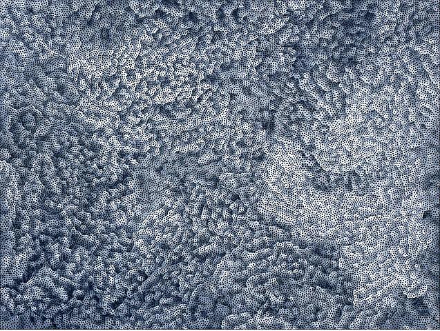
Chosen Artist: Yayoi Kusama
A troubled avante-garde artist, allowing an autobiographical influence in her artworks. Kusama speaks of the painful memories she had suffered while growing up. Her works convey intese emotions such as anguish, hopelessness, obssession and also joy. They have the ability to haunt all of us.
My aim is to design a series of spaces that encourge the occupant to engage with the artworks being displayed. I attempted to set a defined mood relating to each stage of human development. The role of the occupant here is to consider wheather the art dealers' interpretation of human life adheres to the experiences of Kusama, or whether they are contradictory. Then they are also invited to contemplate about their own experiences growing up, comparing these to Kusama and to the art dealer.
Installations by Yayoi Kusama


This is a good installation piece to be placed in the Courtyard.
Artworks By Kusama


