Tuesday, May 25, 2010

Art Gallery Week 3

Narrative: An obsessive man with a passion for landscape art hoards his collection in the confines of his gallery. Each one a precious gem, he pawns them to make his living. Bessotted and longing he imitates the art within the depths of his trove.

Concept: My idea is that this art gallery resembles a jeweerlly box to this Art dealer, every art work holding a story and special significance to him. Whether he aquired it on a trip overseas, or the memory of having to adopt a thrift livilihood to finally possess it.

Analogy: to carry this analogy further, just like a jewerllery bow, the art gallery is to have a strong sense of hierarchy, with three different levels displaying items of decending significance to the dealer. There are also various compartments within the gallery for the display of installations, or the hoarding of precious artworks and a workroom for his imitations. A sense of the dealers' personality and character is to be incorporated into the autonomy of the gallery. Perhaps through the unexpected display of habitation in the gallery-an open kitchen or lounge chair that contribute to feelings of domesticity.
Main Artst: Leading Australian Painter Arthur Boyd
Untitled(english landscape)c.1975
Oil on board
41.5 x 107cm

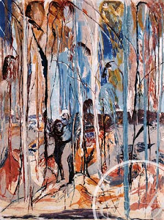
Arthur Boyd "Shoalhaven River Bank and Trees I"

1996, Collagraph, 80 x 60 cm

Arthur Boyd
Wimmera Landscape c.1975
oil on board
90.7 x 121 cm
no.9456

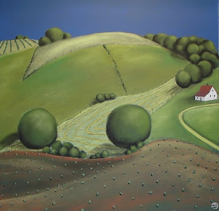
American Painter-Grant Wood

Elizabeth Morris

Floral Charleston painter-Jeannette Cooper Nicolson
New Zealand Painter-Jos Creufrer


Width: 11.75 inches / 30 cm
Height: 11.75 inches / 30 cm
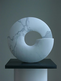
Australian Sculptor-Col Henry

Bulgarian Sculptor-Ivan Minekov
Laura
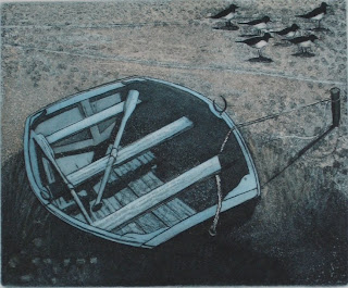
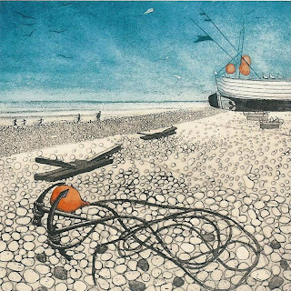
UK sculptor-Christope Gordon Brown

Monday, May 17, 2010

Art Gallery-Week 2

Precedent Studies:
Steven Holl, Nelson Atkins Museum Of Art, Kansas City

'By subtly interweaving his building with the museum's historic fabric and the surrounding landscape, he has produced a work of haunting power. For the art world, the addition, known as the Bloch Building, should reaffirm that art and architecture can happily coexist. (...) He has created a building that sensitizes visitors to the world around them. It's an approach that should be studied by anyone who sets out to design a museum from this point forward. '
-Nicolai Ouroussoff, New York Times, June 6, 2007

But it is on the inside that Holl shows his chops, using the most elusive and difficult materials: space and light. He has designed shape-shifting spaces that flow, like an unfolding narrative, down ramps and graceful steps, with a canted wall here, a curve in the high ceiling there, as a visitor moves through the galleries for contemporary art, African art and photography. Light spills in at unexpected moments, from above or from big panes of glass overlooking the garden.'

-Catherine Macuigan, News Week


Effective lanscaping connects inside and outside.


Interior space carried through to exterior courtyard.
A "Breathing" T-motif used throughout design, for the infiltration of light.

Unexpected shafts of light encountered when weaving through gallery spaces, Art is synthesised with Architecture. Gallery Experience is unique to the individual.

Diffuse lighting created by translucent panels on walls.

Renzo Piano,
LMCA, Broad Museum of Contemporary Art, California


"If you are designing a museum you offer contemplation. It is not enough for the light to be perfect. You also need calm, serenity and even a voluptuous quality linked to contemplation of the work of art. Achieving such a result at the Los Angeles County Museum of Art depends on integrating the new museum into its broader context. That is the purpose of a master plan.
-Renzo Piano


On third gallery level, slanted glass roof with an underlayer of louvres to control light conditions and protect artworks.
Menill Art Gallery, Texas
Louvred roof, allowing diffuse light into Gallery Space

Kimbell Art Musem, Louis Khan
Note the orintation of the visitors facing perpendicular and alongside the movable panels.

Project 3-Site visit


Site 3 Visit
Site spans four shop fronts.
adjacent Building is a Pub.
19th Century Architecture style embedded in surrounding buildings. Busy street with much traffic and pedestrians at front.

Back of site, ample sunlight at rear.
Alleyway to back of site, quiet surroundings

Side street to Library and Police Office.
King st, Newtown street scene uphill.
Aboriginal Art on display on the street. Newtown has a bohemian atmosphere and enthusiastic attitude to local art.


Site Analysis
Summer 6am

Summer 12pm
Summer 6pm


Winter 6am
Winter 12pm
Winter 6pm


Gallerv Visit One: Darrell Knight Gallery, 840 Elizabeth St, Waterloo


Ingenius skylight, the galleries on the upper level need no artificial lighting in the Daytime.

Blinds for diffuse light.

Common occurance with galleries, a ridged roof structure for higher ceilings and better penetration of light.
Height of walls approximately 3.6m.

Gallery Visit 2: Anna Swartz Gallery, Wilson St, Eveleigh

Very nice instalment, with wide white wall and wide door as apart of the composition. Modern and sleek is the atmostphere created.
Installment fills the entire room, Ceilings illuminated with skylights and flurescent lighting.
Very high ceilings, trusses on roof as this is a warehouse.

Gallery Visit 3: Art Gallery of NSW


A series of sky lighting methods shown inthe above photos. All have a common character of high ceilings and a grand, spacious atmosphere. One feels, civilised and contemplative even serene in such a gallery.


GALLERIES AND MUSEUMS DISCUSSED IN THE LECTURE ON 10 MAY 2010
The Louvre extension, Paris, by I. M. Pei
Glass pyramid in the midsts of Paris is a major landmark for the Louvre.
Inside the Louvre Pyramid, the glass was intended to frame the city.

Musée du Jeu de Paume, Paris, by Antoine Stinco
A street like analogy is used in this gallery, where one can freely and unconciously wonder into the gallery and examine the art works, as if visiting a store in the city streets. Circulation is concentrated along one side of the Building and the galleries along the other side. Views of the street outside provided at the circualtion half of Building, giving indications and connections with street life below.
Diffuse lighting from sky windows and ambient artificial lighting.

Musée d’Orsay, Paris, by Gae Aulenti
Gallery is converted from a train station, it adopts a market-like atmosphere with clear circulation system; entrance and exist is linear with on the side, smaller rooms for installation of artworks.

Centre Pompiou, Paris, by Richard Rogers and Renzo Piano
A different approach to designing art galleries, where the spaces are universal, each event can be designed anew in the rooms provided. A sharp staircase is revealed on the facade, to accentuate the forced transition from street to into the Building and upwards.

Dulwich Picture Gallery, by Sir John Soane, 1811-13
Artificial windows, designed to match historical style of Building. Skylighting used to illuminate Paintings.
Interior adopts a living room feel that is cozy and comfortable. Classical Paintings randomly arranged on walls.

Yale Centre for British Art, by Louis Kahn

Ceiling is a grid pattern of glass and steel. This illuminates the room evenly, giving a soft wash of light on the walls.

Louis Khan saw an Art Gallery as a storage and collection, that is a treasury to be shared. There contains many halls, just like a storage room.
Gallery space in Yale, fixed partitions with artworks.